


There is enough development on Capitol Hill and the period between design review and project completion can be so long that it is easy to lose track of what these gigantic cranes are up to.
You’ve probably noticed that the project across from Brix is starting to take shape now that construction has risen above the massive pit. Here’s a reminder of what’s coming in the massive lot — 60+ feet of mixed-use retail, apartments and ground-level townhome units — after another year of construction:
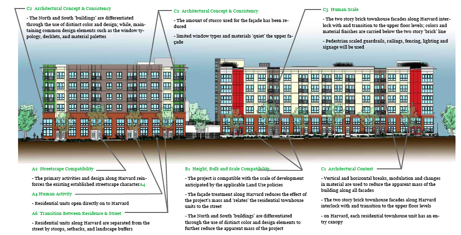
You can check out more of the design details here (pdf).
I had a quick chat with Exxel Pacific project manager David Huber about status of the project. He says the construction should be complete by September 2010 with the larger north section likely to be ready earlier that summer. Amazing how long it still takes to complete projects of this scale. 2010 is far enough off that we’ll have to do another update or three to remind what’s coming.
For another write-up on the project, check out Seattle Courant’s coverage from last summer.
Here’s another Broadway project we recently re-reviewed — this one down by Bobby Morris across from Seattle Central.
Why is Seattle architecture so damn ugly? Can anyone tell me?
I know that it’s not just me. All of my friends seem to agree: new mixed-use architecture in Seattle sucks. And this building on Broadway is just another glowing example. It is horrendous.
Look, accents are fine. But when the entire building is accents the building look tangled and disjointed. What’s wrong with a little consistency? Or a classic brick look? I’m not saying that 700 Broadway East or Brix are exemplars of perfect (or even good) architecture, but it shouldn’t be difficult to look AS GOOD as them.
And what’s with this ridiculous “nice brick at the ground level with cheap siding above” look? Seriously, do you think that we don’t realize that it looks shitty up there? You think that you’re hiding an ugly building from us by putting it above eye level? I look at it and I’m like, “oh my God, did the architects know that they were going to build an ugly building on their nice brick building below?”
This building has five different colors, all of which remind me of cheap Christmas wrapper. Why not just extend the brick all the way up for God’s sake? Or if you feel you need accents, then use ONE. Less is more. All told, this building will be an eyesore on Broadway for decades to come.