


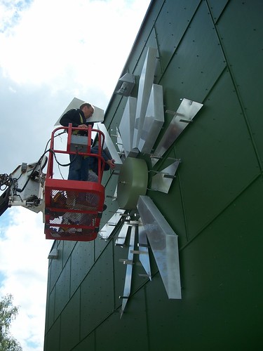
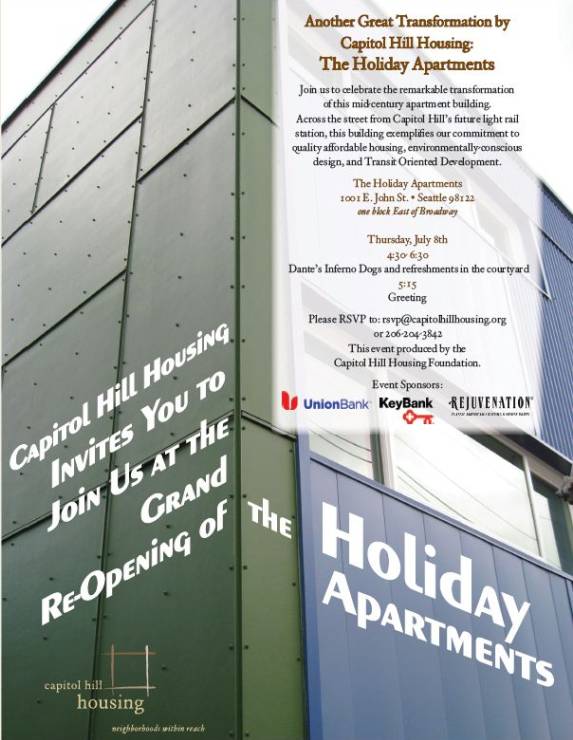
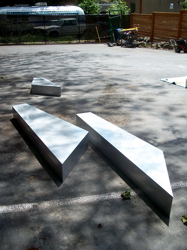
There’s a timely new landmark near 10th and E. John — as long as the sun’s out IT’S A CLOCK! We found this work crew installing a large “sundial clock” on the side of the overhauled Holiday Apartments Tuesday afternoon. We covered Capitol Hill Housing’s work to refurbish the building here.
The idea behind the clocky sundial clock, according to CHH’s Betsy Hunter, is that as commuters run down E. John to catch their bus (or the streetcar come 2013 or the light rail train come 2016) they will be able to check the time. We might have suggested a rainwater filled hourglass. But that would be depressing. Even though IT’S A CLOCK!
For a pick-me-up, mark your calendar for a July 8th celebration of the rejuvenated Holiday hosted by CHH.
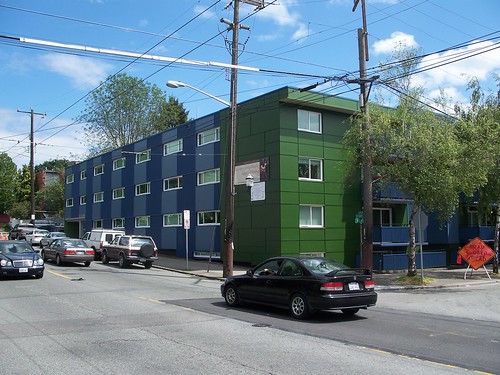
Does anyone else find the metallic green and blue siding horrifically ugly?? I didnt think it was possible to makes those 50’s apt buildings any uglier, but somehow, they managed…
When I walked past there last weekend I thought to myself how nice it looked. So….. no. :)
more horrific design in seattle…
Get over it. This was a really ugly building built as a motel for the World’s Fair. Now it’s all insulated and updated and is affordable housing. Quit complaining about every remodel and new construction project. Maybe progress on the Hill will make for new jobs and you can get off your asses and get a job so you aren’t snarking on here?
It is a clock not a sundial.
the amazing thing is, it doesn’t look that different from some of the new condos i’ve seen around town.
I live super close to it and I also think it’s pretty.
But it’s kinda a sundial clock, right? Updating. BTW, the construction crew referred to it as a ‘sundial’ so we weren’t completely off base!
And, when MRK was out there, the hands weren’t installed yet.
Now they are.
I completely agree. I live around the block from this building and for years I’d walk by it and wonder why the ownder didn’t give a crap about how derelict it was. Now it looks massively better. Maybe the haters enjoyed rusty balconies and broken windows. I for one think the people living there are probably much happier with the added insulation and double paned doors and windows, plus they now have lights for their balconies.
When they first started putting the siding on I though “Oh god, another icky looking condo box’ but now that’s it’s done I rather like it. Saw the clock on my way to work this morning and I think it’s a great touch. The green and blue is nice, much better than the weird earthy oranges and reds that seems so popular with new developement projects. I’m also delighted that it’s affordable housing-Capitol Hill Housing is an amazing agency and I hope our community continues to support their work.
Totally dig both the colors and the materials. It’s Capitol Hill, kids! Kudos to CHH for being bold.
More starburst clocks all over town, please!!!!
It will take some getting used to, but it is way way better than how it looked before. That was one of the most ugly, derelict buildings in the area. This is a great example of how we can retrofit existing buildings rather than just tearing them down.
It looks infinitely better and the clock is rather snazzy…. I think they’ve done a great job with a run-down mid-century eyesore.
you’re right, this is better than it was, but not by much. let’s not be too defensive, it is certainly another poor cap hill design job, it looks like a giant one of those electric boxes out on the curb, or a stack of shipping crates. all i can say is that at least this one’s not bland.