


An architect’s desire to ‘celebrate’ a building’s corner has become so defacto that she or he may be seen as some kind of subversive if they were to do otherwise. My corner problem, as I call it, lies not so much with the intent of being expressive, but in its recent, almost universally poor execution.
 So much design effort is expended on corners today, that they have become buildings onto themselves, resulting in chaotic assemblages of parts reminiscent of Ms. Shelley’s infamous antagonist, but in built form. Garish colors and materials, clumsy canopies, little hats for roofs, and shifts in the building plane (often all together) are common ingredients in this over-cooked entrée. To make matters worse, such celebratory excess is often couched in a building’s need to be contextual (i.e. historical). The fact of the matter is that for hundreds of years most buildings were quite content to go about their business in a dignified manner, either blissfully ignorant of their proximate influences, or, if feeling a bit provocative doing a little something extra at the extremities. The goal was not to make the corner an end onto itself, but to make it a part of an overall design.
There are, of course, great buildings whose excellence has not been diminished by a corner folly here or there; and, dare I say, have even been enhanced by them. Sullivan’s Carson Pirie Scott department store comes first to mind. Here, a gentle curve of the same material that surrounds it, gently acknowledges its prime location. Another distinguishing feature of Mr. Sullivan’s masterpiece is that of its window/structural bay expression going from horizontal to vertical, no doubt a recognition of the structural requirements needed to accomplish the move. Inspired by such a successful example, I set out on a grey day with camera in hand to see what local lessons on corner propriety could be discerned from our very own Capitol Hill, with the hope that not all buildings in the neighborhood suffer from the corner problem and that I may be able to document those that do not.
Certainly a corner does not a building make, and a couple of the buildings in the photos contained herein are part of rather uninspired design; however, those buildings have corners that are at least pretty good, and provide some thoughts as for strategies for designing an expressive corner (or not) for reasons other than an ungrounded and misguided nostalgia for buildings as they once were. The photos start from a working proposition that, to quote Hypocrites, first do no harm; or, at the very least, one should first aim for simplicity and only resort to rhetorical flourishes with discretion, forethought, and an understanding of the ‘precedent’ cited.
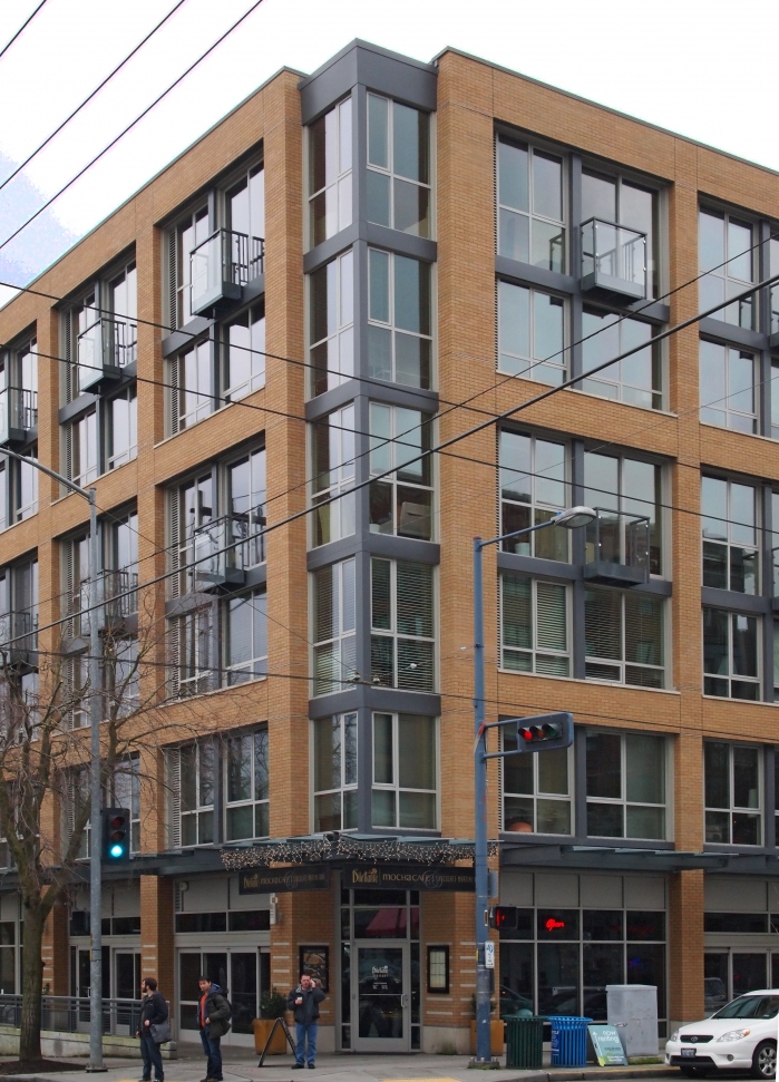
Above, is Agnes Lofts, one of Capitol Hill’s most recent (and best) mixed used buildings. The body of the building is so nicely executed, one wonders why change anything at the corner; thankfully, the accomplished architects at Weinstein A + U felt the same. Well done. Note also the nice subtractive bay modulation on the far left. Well done. Again!
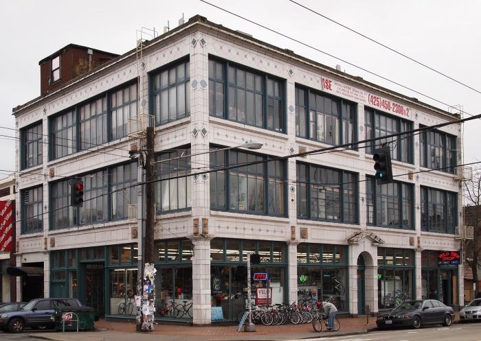
The Velo Bikes building can be seen as a precedent to Agnes Lofts (or not — your choice). Design a handsome edifice with beautiful terra cotta and generous windows, why change a thing at the corner? What could be a more appropriate approach (or more effective)?
 Seattle Central Community College Broadway Performance Hall
At Seattle Central, we have a subtle, yet robust corner. If only more buildings had the confidence to rely on the selective expansion of their existing vocabulary: drop the arched window, swap it out with a combination circular and rectangular. For some added emphasis, add some coigning. Inspiring.
 The Villa
This photo, taken earlier in the year, is of a favorite Pike Street building. Lovingly restored by our friends at Capitol Housing (http://capitolhillhousing.org/), this affordable housing, mixed use building at the corner of Boren and Pike has a lovely wooden storefront running its length, which then turns the corner (and even steps back) just so slightly at the corner.
 Seattle Police Department East Precinct
Here is a rather ordinary fabric building that continues the evolution of the above themes. The regularity of the building’s structural bays is exposed at the corners as the windows push back, signifying the entry. Note the view beyond to Eltana Bagels. A nice logical progression, should one want to add a little corner zest.
 Apartment at Harvard and Roy
There are several of these roadside -motel-inspired (ouch) apartments on the Hill. I have a certain fascination for them, as period pieces more than anything because for the most part they are not very well done (parking dominating the front is a poor display of urban manners). None-the-less, the corner here is notable in that it actually contains a programmatic element – the stairs – and hence, perhaps, a reason for expression (can you imagine, the willfulness!). Want to emphasize a corner and give it some panache, put a stair there and surround it with glass. Very mod.
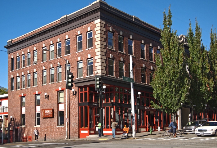
 Brix
Brix
The best new building on Broadway built during our last boom (sadly), this competently designed building does have a nice corner — and an architect’s favorite — to make a corner expressive, make it go away. If done well, as this is, it is an trustworthy and reliable companion. Mithun Architects.
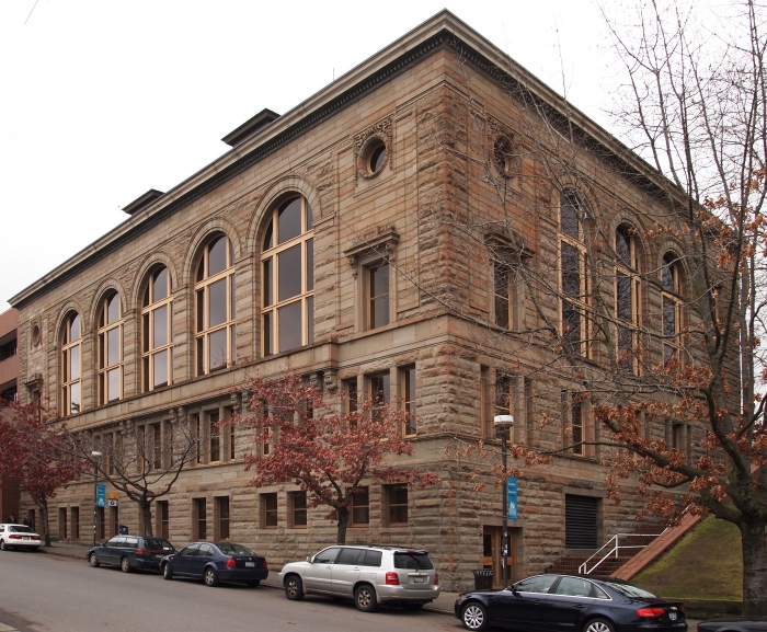
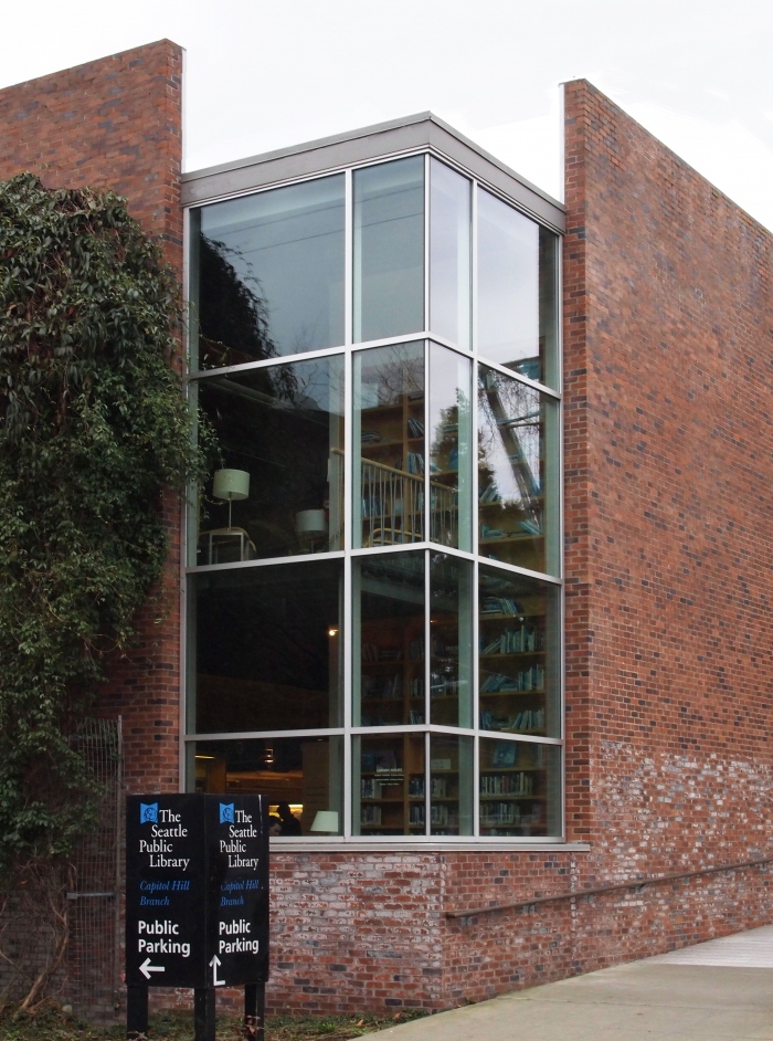 Seattle Public Library, Capitol Hill Branch
A favorite corner of the day (or any day), and for a couple of reasons. It is simple, it is clear, and it is simultaneously distinct from the rest of the building yet wholly of its vocabulary. Nice. And, best yet, it houses a space that is of a different character than the remainder of the building. An expressive corner that actually expresses something inside! Bravo. Johnston Architects in collaboration with Cutler Anderson Architects.
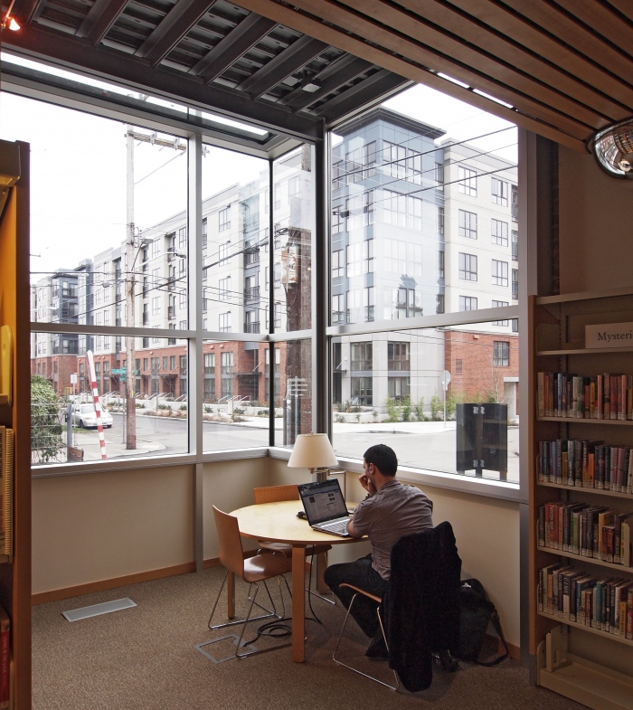
Below, inside the corner window. And across the street, well, a corner problem.
 Seattle Public Library Capitol Hill Branch
Arguably the best corner on a building (or corner building — a typology?) on Capitol Hill, and finally with a suitable ground floor tenant. The architects of this 1900′s beauty designed the boldest of the bold in the world of corners — they curved it. This is perhaps the most frequently botched corner-solution, leading to many a corner problem, yet done here with smashing success. How? because the materials, modulation, and detail are grounded in the remainder of the facades. One of our best heritage buildings, corner or otherwise.
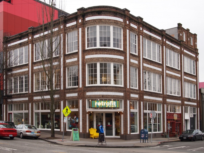 Retrofit Home Building
View corners in a larger map
John Feit is an architect on Capitol Hill, and works at Schemata Workshop. He blogs frequently on design and urbanism, with a focus on how they relate to and effect the Capitol Hill community.
this is nice, I think calling attention to how architecture and design affect our daily lives is great. It would be nice to hear how you think good corners vs bad corners affect the way we interact with these buildings.
have you seen the corner treatment for the proposed building at the B&O site?
Thanks for this piece–I’ll be paying more attention to corners from now on as I walk around the neighborhood. As someone who doesn’t know much about architecture, I was wishing for more examples of bad corners for comparison. Any truly awful corners that you would call out?
Thanks! I really enjoy most of these examples, and it’s nice to know the technical reasons they resonate.
John: Thank you so much for this interesting and informative article. I sure hope you are a member of the Design Commission!
I’m glad you included the Brix building…I think it’s very beautiful and successful, even more so because it includes all-local small businesses at ground level. I am hopeful that the upcoming development at 230 Broadway will be of similar quality.
Very informative and interesting…we have such an interesting urban fabric here on the Hill, I appreciate anything that draws our attention a little closer to it. Please do more!
Good to have this analysis on the blog.
Thanks for exploring and sharing your topic… Not being a native but an owner of a condo in the neighborhood I appreciate your post. I too love the corner of Retrofit…
John Feit’s analyses are terrific. Most new Captiol Hill developments sure seem bereft of great or even good design. And I don’t think it’s just a matter of economics. It’s more a lack of inspiration and regulation. (In this regard, a plague on Weber Thompson.) We need more influence by the likes of developer Liz Dunn (of Agnes Lofts above — and also of the fabulous renovation of what now is Melrose Market). How can we get the City’s planning commission to adhere to the Pine/Pike Neighborhood Development Plan and not just treat its rules and regs as merely window-dressing?
would be an awesome addition to this interesting and informative post. I’d love to do a walking tour of these buildings, but live off the hill and need just a bit of guidance. A google map would be a nice touch!
thanks for the recognition! I am the building owner and we waited a very long time –refusing some “chain” kinds of tenants for the perfect tenant in our wonderful corner space!!
Your welcome. I, of course, think design is very important, and you bring up an interesting point. I’ll put some thought into that!
Too many awful corners, that’s the problem. I think it is always best to provide positive examples from which to learn, as bad ones don’t offer us much.
Thank you, I am happy to have you as a reader and I will try to live up to your expectations. Check out the latest on our site: http://schemataworkshop.wordpress.com/
I will — thank you! Check out the latest on our site: http://schemataworkshop.wordpress.com/
Thanks! By blogging about relatively simple in appearance buildings, of mainly uniform materials and massing and thoughtful details (as opposed to the over-designed fluff we typically get these days), I hope to show people that simple, unassuming buildings are a good way to go.
I sent CHS a map yesterday, hopefully Justin will post it.
No, thank you for your good stewardship and tenanting of your fabulous building!
…Thank you for mentioning The Villa…it’s a great mix of architecture…come by in the spring/summer and check out the hidden jewel of the Villa…it’s great patio..