


 (Images: John Feit)
I have been riding my bicycle past the Harrison Modern for almost a decade now, always appreciative of its design and one that I have been yearning to share for some time. Unfortunately, its predominant exposure faces north, making its photography less than ideal for a majority of the year and thus potentially depriving the building the adoration it so deserves. Imagine my great joy when, a couple of weeks back, I was walking past in the late afternoon — camera in hand — with the lighting just perfect for portraying the Harrison’s many charms.
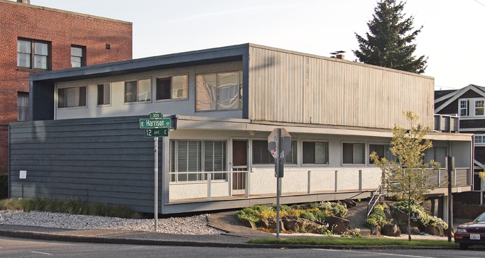
Located at the intersection of 12th and Harrison, the Harrison Modern is clearly a building whose designers were firmly rooted in mid-century modernism. Built in 1951 and designed by Victor Martin, the Harrison is not only exemplary of that era, but it also foreshadows current trends in architectural design in its use of layered cubic forms as exemplified by the work of such contemporary Dutch architects as MVRDV in the Edificio Celosía, pictured below. This stacking design approach, though all the rage now, was most certainly pretty avant-garde over 60 years ago, and continues to mark the Harrison unique among Capitol Hill’s vintage buildings.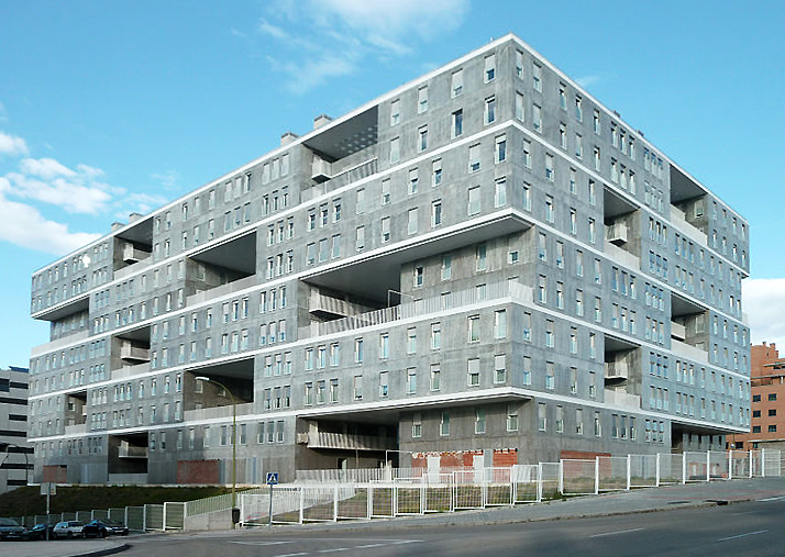
What I am calling a stacked or layered design is one where each floor (or grouped floors) is expressed individually and in a very like manner, without the more traditional base, middle, and top. In both the Harrison and MVRDV example, this stacking is expressed not only by revealing the floor lines, but also by carving out voids for balconies that emphasize the volume of the floors above or below. The Harrison’s design captures this layered design approach to create cleverly framed outdoor spaces that exhibit the modernist desire forblending indoor and outdoor space, including a generous upper floor balcony that must provide a great view of the Puget Sound and Olympic Mountains. On a more intimate scale, the north facing veranda of the Harrison is crisply framed, forming a powerfully simple, elegant, and dignified facade along Harrison Street.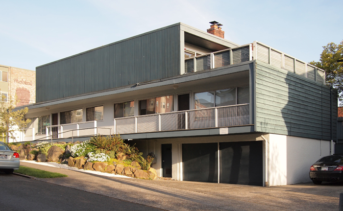
Along 12th Avenue, the busier of the two streets upon which the Harrison is sited, a more formal facade was in order and is fittingly more massive in temperament. The contrast, and utility between, these three elevations is achieved by the simple rotating of the lower and upper floors to best suite their orientation, an ease of effort to effect that has long captivated me. A powerful difference is accorded between the two floors; on the longer, northern elevation is the lower form which represents the void, and on shorter, eastern elevation, it is the upper form. A lower floor ying to the upper floor yang, as it were.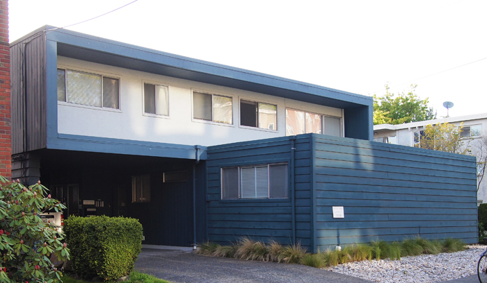
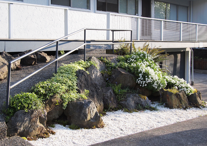 Contrasting the bold cubic forms above are the cascading stones and plantings that mark the entry ramp into the building. While on one level apparently quite different form the building’s aesthetic, this little bit of landscape is actually within the spirit of its mid-century heritage, and provides a finishing touch to one of Capitol Hill’s finest small buildings. If I squint a bit, I can imagine the Harrison at home in say, Palm Springs or Malibu, but am quite content knowing it is our neighborhood.
Recent CHS Schemata Posts
- Save Bauhaus? Better save the Pinevue Apartments, too
- The architectural argument for saving Capitol Hill’s Conservatory
- Capitol Hill’s secret alley
- More

John Feit is an architect on Capitol Hill, and works at Schemata Workshop. He blogs frequently on design and urbanism, with a focus on how they relate to and affect the Capitol Hill community.
I’ve always been curious about that building! Do you know if it is an office or apartments? Thanks for another great post.
I think that it used to be apartments but now Harrison Modern is a set of vacation rental properties, similar to The Maple on the same block. http://harrisonmodern.com
I’ve seen a few of these ramp-plus-step combinations, and they always bother me — why oh why would someone build an accessibility ramp and then put a one- or two-stair barrier at the top? As far as I can see, there is no design aesthetic in the world which can justify infuriating a person in a wheelchair who saw a ramp entry and got up there, only to have to back all the way down (there is never a way to turn around), or — from an ordinary biped’s point of view, for whom the problem is on the way out of the building — come out the door, head towards the ramp, miss the unmarked single step at the top, and tumble down. Am I missing some subtle yet compelling design objective here?
On another level, as always the Schemata folks have written another splendid piece showcasing “our” built environment. Many thanks!
While I always enjoy Josh’s posts, this building’s history saddens me a bit. I preferred the old, tree accented flavor the Harrison used to have. And as many who lived there could tell you, the roofs leaked constantly, a commonplace for flat roofs in the NW. Hope the redo addressed that problem.
Thank you for sharing the link about the rental property. This is good to know for future visits from family and friends. The choice of photo they use to represent Capitol Hill (the Rite Aid sign) is peculiar.
This building is the ugliest of its size for block around. The landscaping touches are nice, but the building itself is boxy and uninteresting. It holds interest as a forbearer of the even uglier box developments a few blocks to the east, but it mostly just looks like a cheap motel with awkward mismatched railing and siding. This reminds me of the “outrage” a few people had over seeing the old broadway BofA building being torn down, even though it was nothing special to look at, unless you liked drive-throughs covered in rocks. Just because a building is over 59 years old doesn’t make it great.
You are definitely missing something. I am not sure what it is though.
I’ve been wondering about this building for years, and now I finally get to hear a bit about it. I wish you’d added a photo of the “Harrison Modern” nameplate, it really adds to the mystique of the place.
I’m curious about the ramp-with-steps, too.
While vacationing in Seattle on two separate occasions, I’ve had the pleasure of staying in two of the Harrison Moderns four units. The layout of each unit is thoughtful. No bedroom or bath shares a wall with any other adjacent unit. The modern interior decor completes the buildings unique architectural design. Also, Impressive was each unit benefits from ample amounts of sunlight. Yet, these units are completely resistant to outside noises. The style and functionality of the Harrison Modern blend beautifully. I applaud the owners for keeping with its’ intended theme.
As for the landscaping, it’s evident that the owners are mindful of urban gardening & conservation.
I love staying in this building, and I look forward to my booked stay in June 2012.
Each unit is like its’ own residence. I appreciate the privacy and the exit from that stacked feeling that comes with most apartments or hotels.
Yes! This building is just hideous! I can only hope that someday it too goes the way of the BofA building – demolished! While I am a huge fan of stacked/layered design (if done correctly) this building is nothing more than an eyesore.
I rented the whole place for keeping guest from my wedding before we lived here. The west side of the building is two bedrooms with a great patio on the south side. The east side unit is a one bedroom. My wife to be and I stayed in that one and the one on top is a one bedroom as well. Great place
No kidding! Thanks for the link. I will have to remember that next time my sister comes to visit with her family.
Here’s what you’re missing. It was built in 1951. The first Architectural Barriers Act wasn’t passed until 1968.
If I were to hazard a guess I’d say they were going for a Japanese garden inspiration, which often has a couple of steps mixed into pathways.
BTW, I have some information about the birth of accessible landscape design buried in the caption of this Flickr photo, http://www.flickr.com/photos/tigerzombie/4604211764.
check out the above link someone provided to see interior photos- the units are really neat inside as well especially the penthouse.
Thanks Robert, for the additional historical information. And yes, that Delridge pedestrian overpass is beautiful.
Some of the most tranquil spaces I have ever been in were in modernist “boxy” houses that were outwardly less than appealing at first glance.
I gotta say, after years of walking/biking by this place and always dismissing it as a boring box, I only recently began to appreciate it, probably because of all the Mad Men episodes I’ve been watching. Funny timing to have this post show up literally just a few months after I starting noticing its charms.
… and writing this from the kitchen table in the upper unit facing the back – the one with the huge deck. Been for 2 weeks and will be sad to leave. This is a fantastic mid-century building and it’s interior decor is also in line with that era. The place is quiet, the unit is large, has lots of hot water for showers, and is very, very comfy. The current owner actually forwarded me the link to this blog, as he knows I’m into architecture. He actually purchased the place from the original family/owner – imagine! The guy had grown up in this very house. So cool.
I myself am the owner of a mid-century home back in Maine, and I understand some people’s feelings that houses/structures of this style/era are “ugly”, because in a way they ARE, but that is part of their charm. Seriously. The “mod” look is indicative of the forward-thinking mindset that was happening at the time, which inspired the uber-“futuristic” “space age” design of the monorail, Space Needle, etc. You look at them today, and it screams George Jetson, and that’s what’s so simultaneously awesome, laughable, and hopelessly sweet and quaint about it. The people who came up with these ideas were pioneers and renegades, and they lived in a time when people looked with great hope and expectation to “the future”, to hold The Answer to the world’s problems, believing that in “the future” things would automatically get better, that science and space exploration would figure out a way around disease, etc., that life would get easier and freer, etc. These days, nobody thinks that way. We’re very cynical. I envy them, back then.
Nice post. I lived here for a couple years on the second floor unit facing 12th. The owner has great taste and is a modernist who also lives there. As you could imagine the plans are open and the walls are white. One of the great things about the rotated plates is that none of the bedrooms had a unit above.
Did you see the site?
http://harrisonmodern.com/