


The 11th Ave drama that is the Poster Giant vs. everybody else war for heart and soul of the Pike/Pine poster wall is about to experience a serious case of deus ex machina.
A representative for Wolff Co., the developer planning a six-story, mixed-use building that will incorporate portions of the old Sunset Electric warehouse at the site, tells CHS that construction fences for the project will go up next week.
Pedestrian and poster-placer access is due for some major changes. The rep tells CHS that the company is aware the importance of the Sunset Electric building’s walls in the community and that solutions are being worked out to continue to provide spaces along the building for posters, art and etc. to be part of the area. The rep said the developers are also aware of the issues with the poster companies and are talking with people in the community about how to best protect the space.
 More on the development here
Poster Giant and other companies in the postering and flyering business have drawn ire from artists, musicians and neighboring businesses tired of having their work ripped down and covered up by mass-advertising efforts that slap up dozens of advertisements for bands, events and movies at a time.
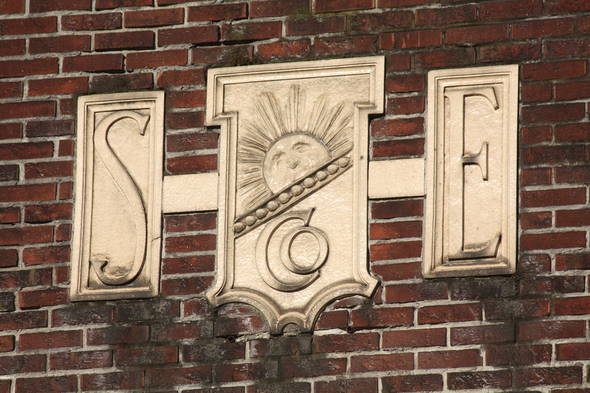
The Sunset Electric building has been empty for years — save for some, um, unauthorized uses from time to time — but its walls have continued to be put to active use as a place for band posters and art — including some iconic street art.
Wolff Co. is also busy elsewhere in the neighborhood as the project replacing the old BMW dealership on E Pike moves forward.
Once the construction walls come down at 11th and Pine, however, it might be time to find a new stretch of empty building side to turn into the new Pike/Pine community bulletin board. The Wolff rep expects postering at the site to fade away.
“We’re going to have nice retail that fits into and is part of the neighborhood,” he said. “We think people will be respectful.”
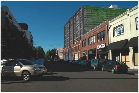 Artist rendering of the planned building (Image: Wolff Co.)
go back to drawing board please..add some style!!!!!!!!!!
I like that parts of the original structure are being preserved but it would be great if they tried to match the top to the bottom. I’m not a fan of these buildings at all. Like Steve said…go back to the drawing board please!
This project hasn’t run the DPD review gauntlet yet, has it? So the rendering is nothing more than the developer’s first sketch of the idea. There will be plenty of opportunity for feedback, and it sounds as if Wolff Co. is relatively sensitive to the needs and desires of the community.
…the visual clusterf**k of the present structure. I love walking by that thing each day.
The planned structure looks a bit dull/’70s institutional to my eyes, despite the wall of green pandering. ALAS.
If you think it’s ugly then you should have go to the design review.
Sorry, I meant “should go to the design review”.
Converting one story warehouse/manufacturing structures into 6-story faux warehouse to loft conversions… could do a lot worse.
I won’t miss the poster blight
(rant alert!)
i too love the visual clusterf**k of this corner but wonder if i’m the only one who wishes these developers would just go ahead and eradicate the whole existing structure, and build their new garbage with some confidence, instead of trying to appease folks with an empty gesture like saving the facade, and speculating that people will be respectful of their money-grubbing endeavor instead of putting up signs like they have been doing as long as i’ve been around (~seven years).
i don’t understand what anyone gains by holding on to a superficial piece of the former charm of the block, and i don’t think their ‘generosity’ or ‘respect’ for the previous fabric is at all evident through this hackneyed design approach (i hope an architect will read and challenge this). they are trying to reshape the space to fit their bottom lines, and i wish they’d just be straight about it…in fact, i’m counting the days until someone is straight in return and pastes signs all over their pretty new windows.
(end rant — i apologize but i’ve been reading henry miller lately and his spirit has taken me over…)
No south facing windows at this latitude???????? Go Seattle. Idiots.
This has gone through the DPD twice. First time a couple of years ago and then again a few months ago after Wolff bought the project. Now, they are ready to start constuction a little over a year after the original target date.
What would the windows see once the building to the south is redeveloped in the future?
Who the hell would want to live on that corner of Douche and Noisy? Ack!
oh no, you’ve ruined me — from now on, I won’t be able to pass through that intersection without calling it Douche and Noisy
I thought that corner was in Belltown.
Posters that are peeling off a wall are in no way art. It is trash.
Personally I’m glad they’re not trying to match the top with the bottom. The Packard building a block further up the hill tries to do that, and IMO it’s not completely successful: the new addition on top is the same color and size as the base, and so you end up with a cornice that used to top off the old building now sticking out awkwardly a third or so the way up the new one. Blending new and old, while often well meaning, is really tricky to pull off without detracting from the old or having the new come off as pastiche.
Instead, the architects here have decided to leave the old as-is, and use the new to set it off as a backdrop; so the modern tower is stepped back a bit (leaving the original parapet intact), and is perhaps intentionally in a ‘bland’ color, letting the original base take the spotlight.
The original plans that CHS reported on way back in 2010 ( http://www.capitolhillseattle.com/2010/06/28/shake-up-for-pi) did have more of an attempt to blend in, with a pediment on the top of the new block somewhat similar to the one on the old facade; but to my tastes it seemed somewhat fake, and felt like it was trying to pass as a 1920’s building when it’s clearly not; I prefer the current modern style instead. But tastes vary, and it’s perfectly fine to like or dislike either version; but I think it’s good to what angle the architects are coming from anyhow.
No douche and noisy is now in Capitol Hill.
As far as douche goes The Stranger has had their office there for years.
I agree. The postering regulations are a reasonable compromise between pro and anti-postering viewpoints, but they are widely ignored and the result is the visual blight in many areas of our neighborhood, especialy Pike-Pine.
The Poster Giant business is a big part of the problem…they are profiting nicely by illegally trashing our streets, and they have an entitlement mentality whereby they think they own certain public spaces, and can do whatever they want with them. Shame!
I’m confident the owners of the new Sunset Electric building will take measures to keep their property free of posters, but that will not help the overall problem.
Wow! I was JUST thinking that what Capitol Hill needed was another mixed-use building that can sit half-vacant for the next fifty years and make the neighborhood look soulless!
I am SO EXCITED for this one! I mean, they’re tearing down the Funhouse to put up a big ugly monstrosity, they’re tearing down the BMW dealership to put up a big ugly monstrosity, Broadway has already lost about half of its charming buildings to make room for big ugly vacant monstrosities, and now they’re putting a big ugly monstrosity on top of another building!
When will they tear down The Comet, the Cha Cha, Linda’s, Neumo’s, Purr, and The Wild Rose to put up big ugly monstrosities? Next year, we hope! Yay! Stupid old buildings. OH! Don’t forget to put in another Sinking Ship parking garage!! That’s AWESOME!
The comment about the planning meeting raises a really good point. If you go to the planning meeting it’s SUPER useful. I was at the one for the building going in the place of that stinky old Funhouse.
The board was really open and loved all of the comments. Lack of parking, lack of fitting in with the neighborhood, sheer ugliness, lack of transportation and amenities, all concerns were met with nods and “That’s not a design consideration” and were promptly ignored, and the project rolled along with no changes.
Bye Bye, Seattle. I’ll miss you when all of your charm has been replaced by empty, over-priced mixed-use buildings that no one wants to live in because there’s nothing charming nearby.