


 Though it will be rendered only in blue and white, Sound Transit has selected a symbol of Gay Pride as the legally required identification icon for Broadways opening-soon Capitol Hill Station.
“Pictograms, as part of our overall general signage program, are not produced in color,” colorful Sound Transit spokesperson Bruce Gray regretfully informed CHS.
The new symbol was spotted by eagle-eyed @gordonwerner in Sound Transit’s latest project update newsletter. Sound Transit also announced that the Seattle-side line of light rail will be known as the Red Line while Eastside extensions will be known as the Blue Line.
The Pride-based icon was selected as part of a design and community feedback process designed to “create pictograms to identify Sound Transit Link light rail stations” that “serve as a tool to easily differentiate stations.” “This is important for non-English speaking audiences, particularly those that do not use a Roman alphabet,” a report on the process reads.
It’s choice comes in a summer of revival for the rainbow flag on Capitol Hill. While the flag continues as a ubiquitous symbol around the neighborhood every June for Pride, the addition of 11 rainbow crosswalks in Pike/Pine has represented a small restoration, for some, of the neighborhood’s eroding LGBTQ identity. For others, it’s a groovy photo op. You might expect a similar response for the Capitol Hill Station icon — though we wouldn’t mind holding the license for the branded blue Pride flag merchandise.

Art inside the station will be, well, kinda gay, too, with war+love machine Jet Kiss (Image: CHS)
In spring 2014, Sound Transit ran a survey to determine what community attributes a Capitol Hill Station icon should include. Here is how the responses shook out (PDF — contains word clouds!)


Apparently our majestic, soaring crow suggestion was ignored.
Pictograms for the light rail system are also required by state law. According to the agency, light rail station pictograms must meet these criteria:
• Simple in form, and are an easily recognizable symbol
• Readable at many scales; including signage, print material, online and mobile devices
• Are individually distinguishable and read as a family
• Meet the requirements of the Americans with Disabilities Act.
Additionally, “the pictogram may reflect the nature of the environment: neighborhoods, landmarks, geographic locations and may include points of interest around the stations.
Capitol Hill Station and the 3.1-mile twin tunnels connecting UW Station to downtown via Broadway is slated to begin service by early 2016. CHS showed you inside the under-construction station here in May. Last week, Sound Transit announced the first phase of testing the new tracks was successfully completed, opening the way for final testing this fall as light rail trains will empty of passengers downtown before making the 8-minute run to UW to put the tunnels and new systems through their paces. Meanwhile, above ground, the project to develop the property around Capitol Hill Station as a mix of affordable and market-rate apartments, commercial space including a new grocery store, and community space including a farmers market-friendly plaza has begun.
UPDATE: Not an option but… “make it color“
Is Sound Transit trying to win the award for “public agency run by the most thick-headed people” award?
Seriously – a symbol is chosen whose overwhelming essential, definitive and primary feature is that its a RAINBOW – for a pictogram that expressly cannot be in color?!?!?!?!?
How in the name of the good Lord (or good Goddess) above is anyone supposed to look at that thing and go “oh, yeah, that’s obviously a gay Pride flag”?????
I commend ST for wanting to acknowledge the LGBT community for the CH station. They SHOULD do so. The station identification SHOULD. (Though there’s an argument to be made that the artist who designed the giant pink and purple exploding dildoes inside the station was making a sneaky & cheeky reference to the gayborhood’s identity…)
But c’mon – pick something that translated regardless of color. I dunno – the pink triangle kinda wants to be pink, but if I see an upside-down triangle, my first though is usually LGBT. Or how about the equality symbol (which I think a large part of the population, gay or straight, immediately knows what it means at this point). Or the equality symbol with the gender-queer/interest symbol on top. Or a bear paw print in a cheeky reference to the bear community. Or a silhouette/bust of a leather daddy with giant moustache. Or an eagle with a cocktail (though, my like this colorless rainbow flag, nobody would actually get the LGBT reference)
Or, I dunno, acknowledge that it isn’t some sort of holy law that your station logos needs to be 100% blue, and make an exception in this case for something that actually needs to be in COLOR in order to make any sense, and just for this one station, make the damn thing in color. Or did they get some sort of special deal on blue paint from Home Depot?
OhFOrGodsSake, chill out. It’s a nice symbol anyway. And there’s the “CAPITOL” connection too, right? Yes, it would’ve been nice in color, but we don’t have to have rainbows everywhere to remind us we’re gay, do we?
Actually, there is a law stating the images cannot be in color so they are easily recognized by everyone.
Pride Flag is the last thing I would have thought of. It reads as flag which is ok but it felt odd as a symbol for Cap Hill. The Pride flag sort of makes sense but it’s also a little anachronistic but at least its better’s than the neighborhood symbol of the columns and the dome.
It looks like the American flag, and coupled with the two A-4 Skyhawks suspended from the ceiling of the station, it looks more appropriate for the Sound Transit 7 expansion station to NAS Whidbey.
I agree completely, and the word “numbskulls” comes to mind as far as whoever made this decision. The flag is not a gay symbol without the rainbow colors! Hopefully, ST will re-think this and come up with something more appropriate, whether it be a real Pride flag or something else.
The state law that mandates “no color” is really stupid. How exactly does this make a symbol more recognizable to everyone?
I think it will be up for about… EXACTLY one night before someone has snuck in an added the color.
This is Capitol Hill folks….
Yes please :)
The “equal” sign looks remarkably similar to the Chinese/Japanese/etc. symbol for the number 2: https://en.wiktionary.org/wiki/%E4%BA%8C (and it probably has other meanings, too).
Maybe a rainbow, even colorless, would be more obvious?
Are you worried that Chinese and Japanese people can’t tell the difference between = and 二, and they will be greatly confused? I think most of them are aware of the equal sign and can figure it out. Also it really isn’t that similar, the spacing of of the Chinese two is much greater and the upper line is shorter.
It looks like a Federal installation: a post office logo, or a forever stamp – and we most likely won’t have a post office nearby. Certainly doesn’t evoke the rainbow flag.
Converting a rainbow-colored flag into two colors? About as stupid as using a flying carpet (or is that a wet noodle?) for the Airport Station instead of say…an airplane. But this isn’t a big surprise. Signage has never been Sound Transit’s strength. The Westlake Station signage remains one the most poorly designed, unintuitive messes I’ve ever encountered. I expect the Capitol Hill Station and U-District stations to be equally confusing. Good thing I know where I’m going, more or less. I feel sorry for our visitors.
“The Pride-based icon was selected as part of a design and community feedback process designed to “create pictograms to identify Sound Transit Link light rail stations” that “serve as a tool to easily differentiate stations.” “This is important for non-English speaking audiences, particularly those that do not use a Roman alphabet,” a report on the process reads.”
And yet the Red Line signage will all be blue?
Someone will surely fix this oversight with colored pens or something.
:D – Yuuuuuuuup
#sharpieBrigade !
This is all well and good, but it I still have to wonder how we ended up with A FIGHTER JET!! as the main piece of station art, not created by a local artist, costing a small fortune, when there was so much community opposition???
Maybe they can insert a cute image of Starbuck from Battlestar Galactica? That might help.
The deconstructed pink fighter jet dildos are amazing! I am so glad they Sound Transit went with art that is provocative rather than safe and bland.
And while we remain fixated on the colors, or lack of colors, on the homage to gay pride, the nation continues to progress forward with the official legalization of marijuana in Oregon!
Are rainbow colored sidewalks, and flags rainbow colored flags hanging from every other building, not enough for us? Does everything need to be rainbow colored?
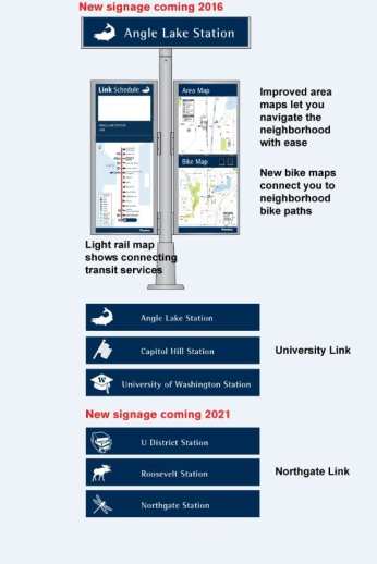
Let’s just be happy that they even paid homage. How about that? They could have used a ‘hill’ as an icon just like Angle Lake Station using a ‘fish.’
And let’s not forget there is already a work of art inside that represents lgbt, drizzled in pink. Or do we need a flag hanging from the tail section so people ‘get it?’
C’mon everyone, let’s keep focus on the bigger picture! After all, LGBT and marijuana both won in this last week or so.
Sorry, please remind me again how Oregon law has anything to do with the Cap Hill light rail station???
Really? lol
Again…look at the bigger picture (not just the first paragraph of what we wrote): Freedom, victory, progression…
In other words, let’s keep fixated on the bigger picture, of the walls coming down, than nitpicking details.
Guess they didn’t go with my disco ball suggestion.
that would have made more sense.
Honestly, between this and the stupid fighter jet, this station is going to look to any new people like there is or was a military base in the neighborhood.
Maybe we could take up a collection & petition to add it later. :-) Why not?
LOL, it does look very “Federal’ish” like the PO. Would have been better to leave it rectangle, no flagpole. IMO, that would have been made more of a Pride Flag statement as you don’t really see them on flagpoles that often since they are usually hung in place. Oh well, I appreciate the nod given to the neighborhood.
The fighter jets are amazing. They are jets that are cut into pieces, painted pink, and kissing. So anti-military and perfect for our station.
Couldn’t they have just done a rainbow? I mean, really? Easy enough to do and it makes it more obvious.
Of COURSE everything doesn’t have to be gay or rainbow-colored on Capitol Hill… Could people be more obtuse? The objection isn’t that the pictogram isn’t in color. The problem is that they chose a symbol that BY ITS NATURE is a rainbow. If they can’t have colors, then choose a symbol that doesn’t require them. That’s NOT a Pride flag. A Pride flag — by definition — has colors on it.
So pathetic. MOST people residing on Capitol Hill are not gay. Stop the divisive, exclusionary, PC insanity. This is beyond embarrassing. Oh, I forgot. The crosswalks are beyond embarrassing.
Someone feels very passionate about crosswalks and transit signs.
It’s a historically gay neighborhood. If that makes you uncomfortable, perhaps a different neighborhood would suit you better.
I could really care less about the transit signs or the crosswalks. However lets be historically correct. Capitol Hill was known as a ‘gay neighborhood’ for a short period of time. Wish it still was a gay hood.
It’s a good point. Why choose a gay symbol for a neighborhood which is already much less gay than it was 20 years ago, and will probably be even less gay 10-20 years from now?
its also a historically catholic neighborhood and then the gays “gentrified” it. point is neighborhoods change including this one, by the sound of many on here you’d think the neighborhood was entirely built from scratch by gays in the 1970s and that this neighborhood has to be frozen in time as a gay ghetto.
Anyone else burned out on the whole “Pride” thing? We get it.. you’re gay.
I am glad that sound transit has picked this icon, but the guy complaining about the absence of color has a point. Maybe an actual rainbow would be clearer in monochrome? The monochrome flag just looks like a flag.